The Tongue Map Every American Kid Memorized Was Based on a Botched Translation
Photo: Emily M., CC BY 3.0, via Wikimedia Commons
If you went to school in the United States anytime between the 1940s and the early 2000s, there's a good chance your science teacher drew a picture of a tongue on the chalkboard and divided it into zones. Sweet at the front. Bitter at the back. Salty and sour somewhere along the sides. It was clean, memorable, and satisfying in the way that all simple diagrams are.
It was also completely wrong.
The tongue map is one of the most persistent errors in American science education — a myth so thoroughly embedded in classroom culture that most adults still believe it. And the strange part is that the mistake wasn't even original research. It came from a mistranslation of a 19th-century German study that nobody bothered to double-check for about a hundred years.
Where the Diagram Actually Came From
The story begins in 1901, when a German scientist named D.P. Hanig published a paper called Zur Psychophysik des Geschmackssinnes — roughly, "On the Psychophysics of the Sense of Taste." Hanig's paper was a legitimate piece of early sensory research. He mapped subtle variations in taste sensitivity across different parts of the tongue, noting that certain regions seemed slightly more responsive to certain flavors.
The key word there is slightly. Hanig never claimed that any part of the tongue was exclusively dedicated to a single taste. His findings showed minor differences in sensitivity thresholds — variations so small that they were arguably within the margin of experimental error. He was describing nuance, not geography.
Here's where things went sideways. In 1942, a Harvard psychologist named Edwin Boring translated and adapted Hanig's work for an American textbook on experimental psychology. In the process, those subtle gradients got redrawn as hard borders. Mild regional differences became absolute zones. A nuanced finding about sensitivity became a map with clear territories, like a flavor atlas of the human mouth.
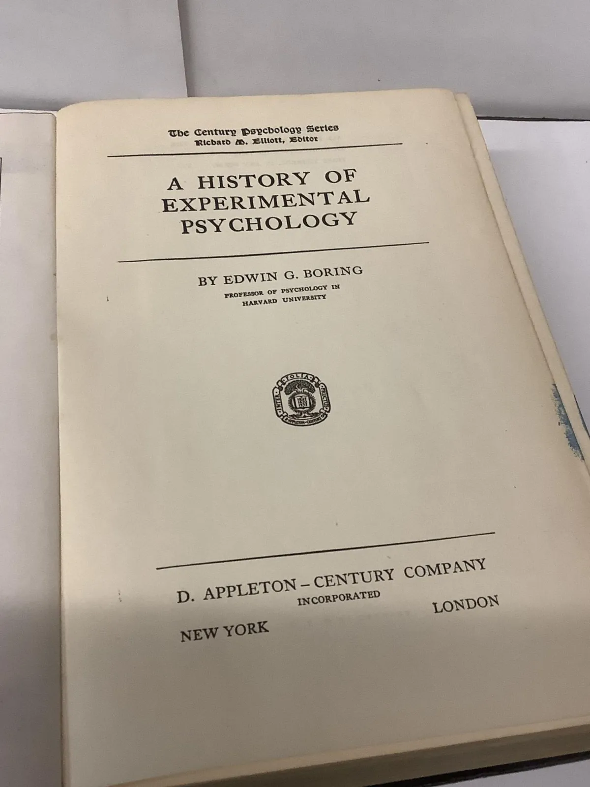 Photo: Edwin Boring, via chamblinbookmine.cdn.bibliopolis.com
Once that diagram appeared in an influential American textbook, it spread. Teachers taught it. Students memorized it. Publishers reproduced it. And for decades, nobody with authority went back to the original German paper to ask whether the translation had gotten things right.
What Taste Science Actually Shows
By the 1970s, researchers were already raising serious doubts about the tongue map. Virginia Collings, a scientist who revisited Hanig's original data, found that while there were tiny sensitivity variations across tongue regions, they were far too small to justify the neat diagram showing up in classrooms. More importantly, every region of the tongue she tested could detect every basic taste.
 Photo: Virginia Collings, via ilarge.lisimg.com
The science continued to pile up against the myth. Researchers identified taste receptor cells distributed across the entire tongue surface — not clustered into exclusive zones. Studies showed that people could detect sweetness at the back of the tongue and bitterness at the tip, directly contradicting the map. The evidence wasn't subtle. The tongue map was simply wrong.
And then, in the 1990s, taste science took an even bigger turn. Scientists discovered a fifth basic taste that the old four-zone diagram had ignored entirely: umami. It's the savory, meaty quality in foods like mushrooms, parmesan cheese, soy sauce, and ripe tomatoes. Umami receptors, like all the others, are spread across the whole tongue — not confined to any special region.
Some researchers are now exploring whether additional taste categories exist beyond the current five, including candidates like fat taste (sometimes called oleogustus) and starchy taste. The tongue is turning out to be far more complex and far less tidy than that chalkboard diagram ever suggested.
Why the Wrong Diagram Survived So Long
So if scientists were correcting the record by the 1970s, why were American kids still staring at the wrong diagram in the 1990s and beyond?
A few things kept the myth alive. First, textbooks move slowly. Once a diagram is printed, it tends to get reprinted. Publishers update content incrementally, and a small illustration in a middle school science chapter isn't always the first thing to get a fact-check. Teachers who learned the map themselves had no particular reason to question it — it appeared in their materials, it was easy to teach, and it seemed to match everyday experience well enough.
There's also the psychological appeal of a clean, organized diagram. The tongue map feels right. People can sort of convince themselves they taste sweetness more at the tip of their tongue or bitterness more at the back. Confirmation bias fills in the gaps. Once you've been told the map exists, your brain has a way of finding evidence for it.
The myth also had no obvious harm attached to it. Nobody was getting hurt by believing in taste zones. That made it low priority for correction, even as the scientific consensus moved firmly in the other direction.
What This Means for How You Actually Taste Things
The practical takeaway here isn't just about correcting an old diagram. Understanding how taste actually works changes how you think about food, flavor, and even why you like or dislike certain things.
Taste receptors are distributed across the tongue's entire surface, and taste perception is also heavily influenced by factors that have nothing to do with the tongue at all. Your sense of smell accounts for a huge portion of what you perceive as flavor — which is why food tastes flat when your nose is congested. Temperature, texture, and even the color of food influence how your brain interprets taste signals.
The tongue, in other words, is a starting point — not the whole story.
The Real Lesson
The tongue map myth is a good reminder that being taught something in school doesn't make it true, and that scientific diagrams can carry errors for a very long time when the original source material is never checked. A minor mistranslation in a 1942 textbook shaped how millions of Americans understood their own senses for generations.
The actual picture is messier and more interesting than the clean zones on the chalkboard. Your whole tongue can taste everything. And that's a much better story than the map ever was.